The uncanny valley of design sketching
Note: The original opinion piece contained images referencing the subject matter, with credit. To avoid further conflict, I have removed said images, but stand by the main point of the piece, that it seems odd to me to manipulate ones work in this way.
What is real anymore?
I started sketching almost two decades ago and much has changed. I saw the digital revolution coming but what I did not anticipate was how hard it would prove to discern a real sketch from one heavily augmented by drawing asset tools or being able to figure out whether a sketch was really done on paper or not. This time, I did not imagine.
No “quickline”, just real skill
What I’m referring to is a somewhat pervasive trend on social media that I’ve noticed designers and design students propagating — taking a photo and staging digital sketches into reality to suggest one skillfully executed the sketch in context, as well as hyper-style-punching a sketch in context using digital compositing tools.
I’ve written articles and even produced video content on the purpose of types of sketches, but these leave me scratching my head and wondering WHY? What’s the purpose of this strange new type of sketching? Well, not so much WHY as I wonder, “do you realize what you’re doing?”. You can peep that video here below in the notes (bottom of the article).
The Augmented Designer
What is skill? Where does proficiency begin and end? When it comes to digital sketching, the line is being erased, not blurred, when it comes to needing to maintain a certain level of proficiency to create informative, emotional, presentation and ideation sketches.
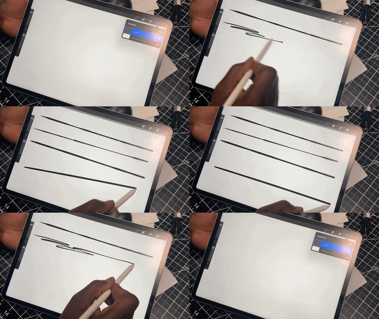
I foresee a future in which the designer becomes the curator, and less the executor in a low-level sense. More on this topic another time, but with tools like Procreate on iPad Pro, Adobe Fresco and Autodesk sketchbook pro implementing quick-draw assist tools and a slew of guides, the fine tuning of skill is becoming less needed in one’s career.
At the same time, although we do have these tools at our disposal as designers and illustrators, I have still found in these stages of my career that I need to be able to not rely on these drawing aids so that I can sketch on the fly, in-situ with a client or other designers. If you get too used to these tools, they can become a crutch upon which you depend to do all your work. That being said, your mileage may vary. A great way to have a good idea is to explore a lot of them, and a great way to explore ideas is to visually communicate quickly. Using tools to create picture perfect layouts can be problematic and misrepresent the rawness of the design process.
Mixed reality sketching and hyper-shopping are two trends that I think lean a bit too heavily into presentation and lack a few things that make traditional industrial design sketching engaging, informative and provocative.
Mixed Reality Sketching
Mixed reality sketching is what I’m identifying as the trend of digitally compositing a sketch onto real paper or other media. Sometimes these sketches are even composted with real tools, suggesting the work was done with real pencils, markers pens and so forth.
The premise seems disingenuous and confusing to the uninitiated trying to learn the process of design. While they look appealing, I question the reasoning behind the sketches being presented this way. After some thought and consideration, I came to the realization that our reality itself has been bent, warped and altered by the existence of social media.
Social media, along with advanced technology tools, platforms, ecosystems and the almighty algorithm has given rise to the “influencer” culture where moments and content are synthesized and staged to produce the most “likes”.
Historically (and I’m being generous here) a “like” represents some measure of validation and “goodness”. For design and illustration, however, a “like” is a very shallow measure of value or merit in response to your work. A like requires little to no effort and offers nothing by way of critique, thought, feedback or means for improvement. Occasionally a creator will receive feedback through comments, but such feedback is more reminiscent of a congratulatory echo chamber celebrating the novelty in presentation and skipping the critique of content. And if not, such critique is so extreme that it touches on insult.
Perhaps a silver lining in the current Covid-19 crisis is the decline of influencer culture to some extent and the crisis seems to be a forcing function for more authenticity in the world. Design sketching may very well need to also lean into authenticity in presentation and approach.
What’s disturbing about this trend for me is that there seems to be deceit at the premise of the presentations of the idea. Sure, the idea may have some substance at its core, but to suggest that the presentation was executed in-situ, by hand, is egregious and bereft of integrity.
Digital sketches placed in context alongside markers - there is a magic pen, after all!
As I’ve considered the trend, I’ve also thought that perhaps a driver or reason for such presentations is to market one’s skills as a designer or “design-astrator” - to cut through the noise of content and attract fans for more “likes”. With that potential motive in mind, the trend makes complete sense! The presentations are attractive and intriguing, but entirely for the wrong reasons. Again, if I’m marketing an image as being representative of my skills and capabilities, compositing sketches that are clearly done digitally onto pads of real paper at the beach, your favorite sporting event or other equally unlikely scenario is disingenuous at best.
“Hyper-shopping”
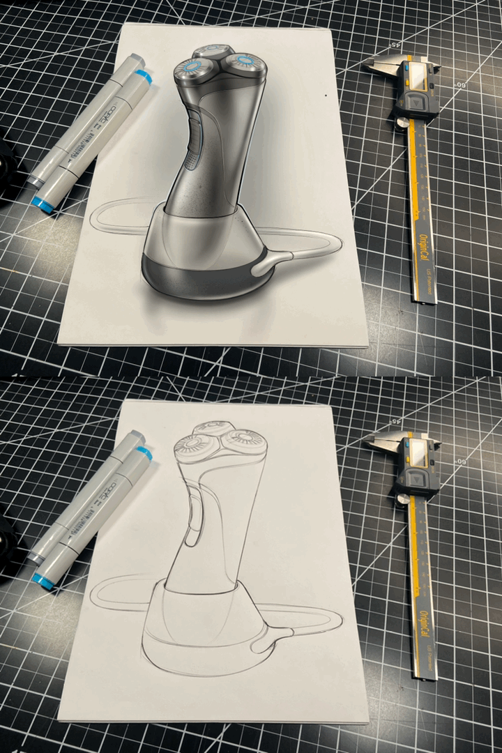
Another trend I’ve observed is what I’m calling the hyper-shop. Take photo of a pen or pencil sketch, place it into your favorite photo editing tool or mobile drawing suite and apply highlights, shadows, textures, reflections and elements to make it POP, all while maintaining the context for the sketch, complete with markers, pencil shavings, or other analog tools.
Oft times, without indication, these hyper stylized sketch-renderings are posted, again, with the implication that this was done by hand, in-situ, HASHTAG NO FILTER.
I tried to make one for myself. It felt… odd, but still, a fun exercise.
What’s problematic here, is while an experienced designer can spot the “weirdness” in the presented juxtaposition of analog and digital processes that ignores transparency of process and muddies reality, the social media appeal and like-fest is a quick hit validation of sorts for the work.
This is democracy at its worst.
Example of context added to a sketch, in this case, implausible.
Influence
Whether you like it or not, at a certain point on social media, we all become “influencers”. When your fan base grows and more people look up top you, by default, you become a standard bearer for best practices or representative skills in your field.
In the summer 2019 Innovation magazine, Hector Silva, IDSA and head of the Advanced Design organization writes:
“As designers who use Instagram as an unofficial portfolio platform, it’s our responsibility to be honest and straightforward about the content we post—for the sake of fostering a healthy design community and to provide the appropriate knowledge and expectations to aspiring designers who could be our future colleagues. “
I wholeheartedly agree with the sentiment expressed here. You should also take some time to check out the rest of the article.
I recognized this years ago when I started IDSKETCHING and sketchaday as online properties. People look to me for advice on sketching, I host workshops and a 3 times weekly live presentation to teach people correct processes for sketching and developing ideas. Because of that, I have to make sure I do things correctly. I’m not perfect in my understanding or execution, however I do take seriously my responsibility to communicate the correct information to my “students” and observers as much as possible.
I’ve also learned to be open to feedback when I am wrong, and I do hope that those following this trend will participate in the conversation and be open to making changes that present their work in a more authentic light.
Does it matter?
Another designer and friend of mine, Michael DiTullo, recently said something interesting in an interview on Core 77 that resonated with me — A rendering is a statement and a sketch is a conversation — I’ve had similar thoughts about sketching throughout my career as being a conversation on paper, sometimes with yourself, but oft times with others.
I’ve pondered this question over and over. Does it really matter if designers are presenting their work online in an authentic way? The answer for me is… maybe.
I can see the validity of creating buzz and marketing hype around yourself as a designer, but at what cost? If you’re not being authentic and forthright in the representation of your skills in a medium that is traditionally regarded as a measure of skill and the ability to communicate ideas, what then? What of the representation or misrepresentation inherent to the work as presented? A potential employer may be drawn in by your work, but that expectation for that level quality delivered in a timely manner, doesn’t often square up with real life in a real professional setting.
In conclusion, I do think that fundamentally, anything we do as designers should come from a place of honesty, transparency, authenticity and integrity and these sketches do not represent those key qualities to me.
Let’s keep it real.


